Two years ago I posted what I considered Vital Signs for the long term economic health of the US. It focused on total outgo vs. total income, resulting deficits, budgeted government expenses vs. transfer payments, interest payments, and social insurance income and spending. There was no good news in that earlier post, and the situation has only worsened in the two years since then.
I used to consider myself a conservative but with today’s conservatives in a ditch on the right and today’s liberals in a ditch on the left, hardly talking to each other and having few or no common interests except getting re-elected, I have abandoned that terminology. However I am fiscally conservative (adjective) and believe that we are weakened by consistently increasing deficit spending and the resulting debt. I have commented previously that it is disturbing to realize that the argument between conservatives who always want to reduce taxes and liberals who always want to increase spending has resulted in a destructive compromise: Lets do both!
So, just to update key points, I am repeating below the charts from the earlier post and adding new charts including the additional two years of data. In spite of claims by the previous and current presidents about their booming economies, there is no evidence of such economies in these hard numbers.
A Chart from Two Years Ago
Updated Chart with Deficit Line Added
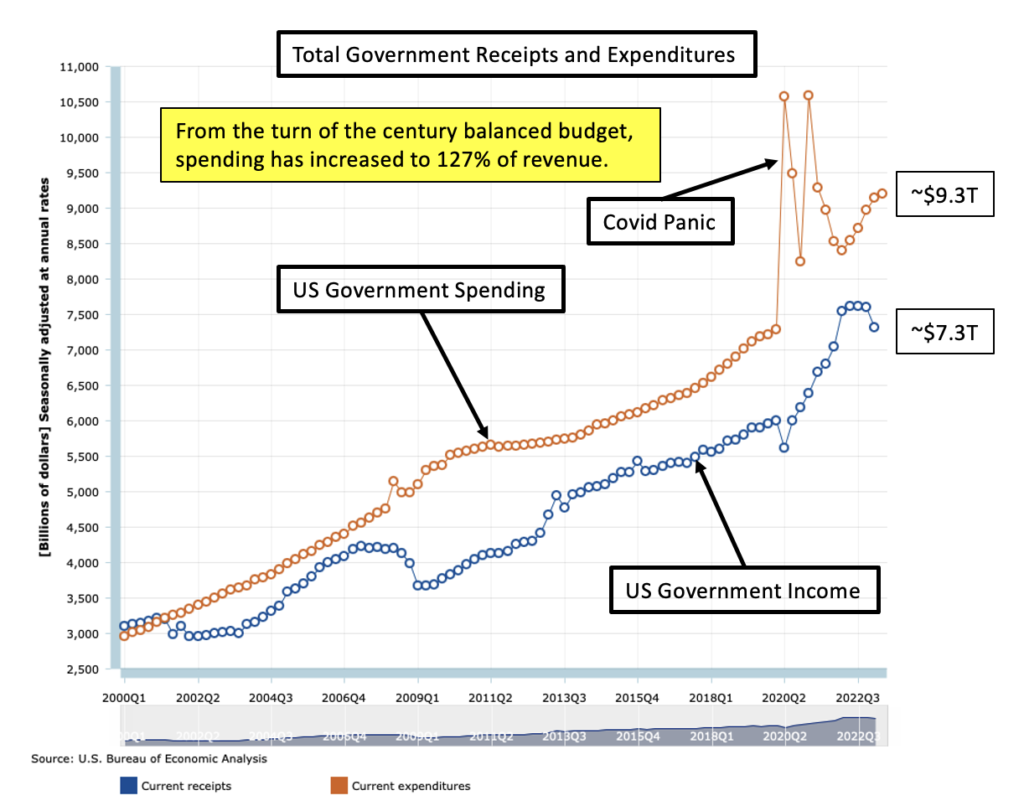
At least the gap is increasing slowly but, unfortunately, is at levels not seen since the 2008 real estate crisis.

A Chart From Two Years Ago
Updated Chart – The Gap Increases
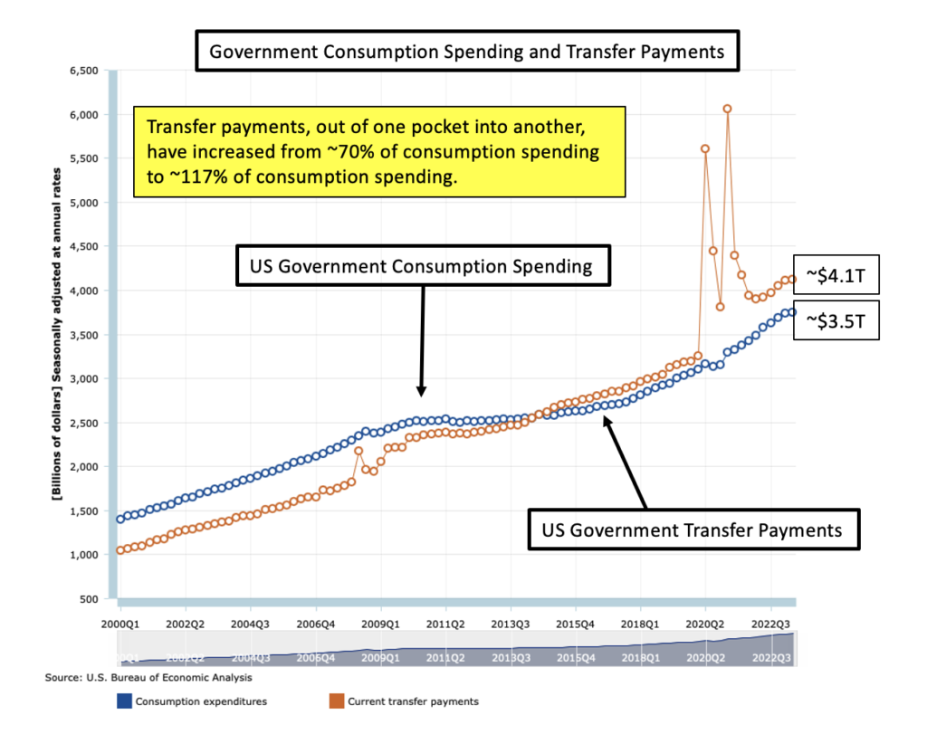
Over this 24 year period transfer payments to individuals and states have increased from 70% of budgeted government expenditures to 115% of budgeted government expenditures. Is it any wonder that infrastructure is crumbling?

A Chart From Two Years Ago
Updated Chart Including 2024
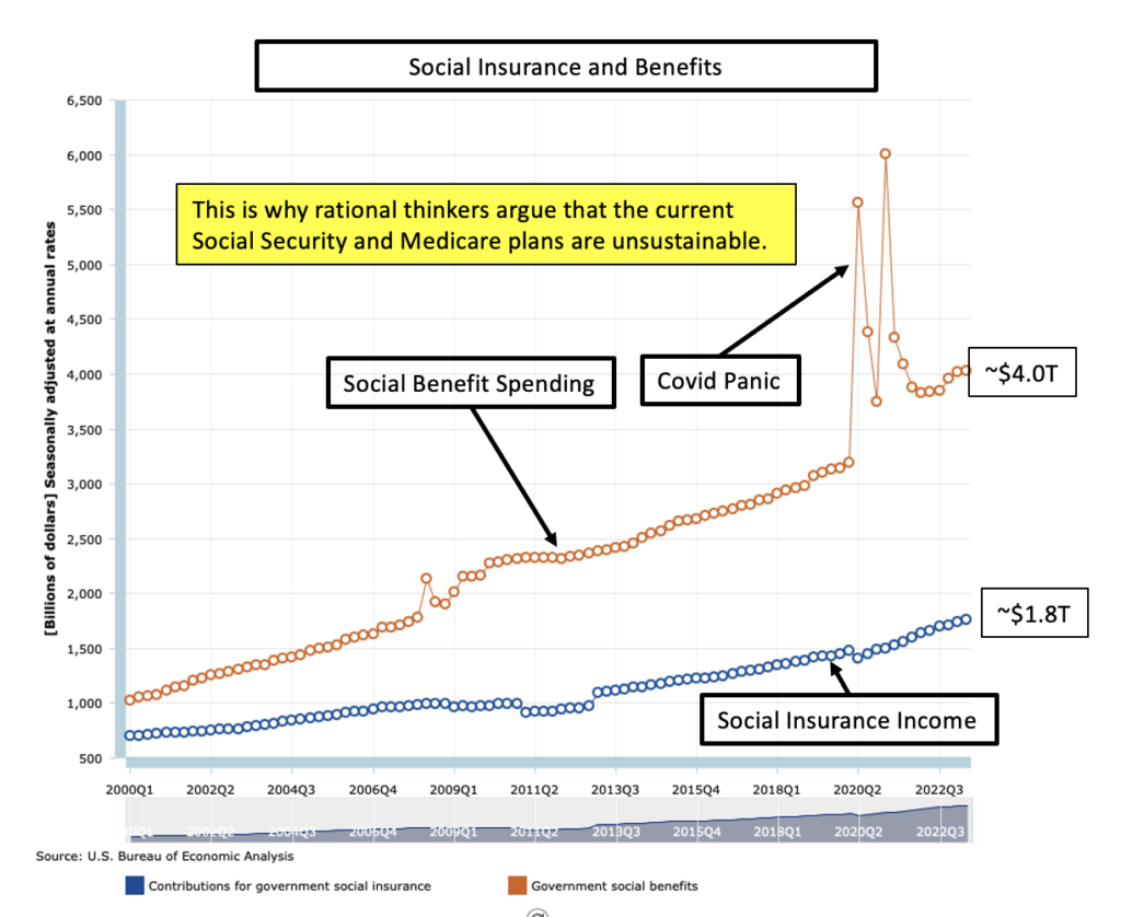
Two years ago social insurance income was covering only about 45% of social insurance spending. Now it is covering only 43%, not a huge change but a deadly trend. These charts are a bit misleading since the Y axis does not start at zero.

A Chart From Two Years Ago
Updated Chart With Interest Expense Added
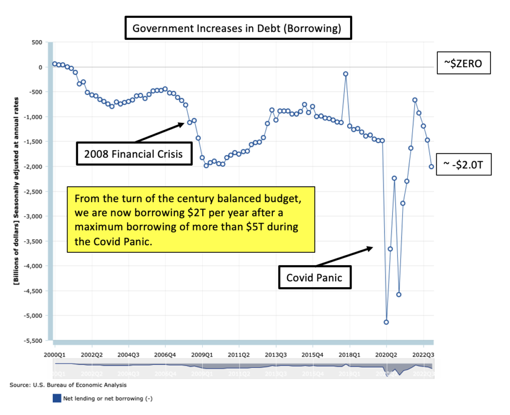
Near zero interest rates were put forth as a justification for borrowing more. Everybody knew interest rates would rise, but it was easy to just ignore that reality. Now interest payments on government debt account for about two thirds of the deficit.

The National Debt
Looking at the National Debt Clock can set one’s head spinning, but it is worth a look. According to it, our current national debt is $35.7T. FRED provides this gloomy chart of debt as a percent of GDP. A time period can be chosen so I chose the same as for the charts above. Our debt since 2000 has increased from about 55% to 120% of GDP. The 2020 spike represents panicky Covid spending.

Summing Up
In the original post, Vital Signs, there is more explanation and discussion of these issues and instructions on how to access and examine the expensive data and charts generously provided by our government. Consider taking at look at that post along with this one for more explanation.