My source for data on federal, state, and local government spending is  almost always the Bureau of Economic Affairs National Income and Product Accounts. I occasionally get expressions of skepticism as complex as “There is off-budget spending we don’t know about,” or as simple as, “That is inconsistent with what I have been seeing elsewhere.”
BEA counts all spending whether “on budget” or “off budget.” And inconsistency with figures seen elsewhere can often be explained by choices people make in data selection and time periods to make the data fit some narrative they are promoting. And it is true that different parts of government have slightly different accounting systems and different agendas to promote.
I try to avoid the “careful data selection to defend an agenda” sin by always including long term trends. I usually begin charts with 1960, the year I graduated from High School and a year marked by the first imported cars showing up in Tennessee (VW and Simca) or 2000, the last time we had federal budget surpluses. But sometimes I will go way back to pick up the Great Depression and/or WWII years.
Anyway, if you are really interested in data, the BEA NIPA site is loaded and friendly. Here is a primer that explains how the data are collected and presented.
And, if you catch me quoting data out of context and with no source given, point out my error and I will endeavor to correct it.
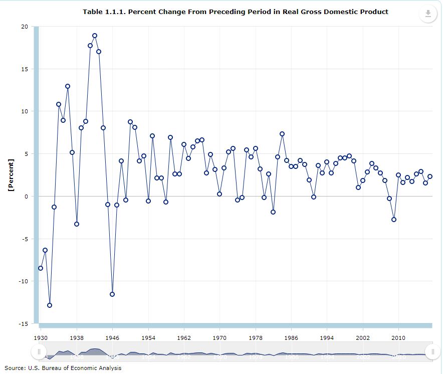
As an example of how easy to use and powerful the BEA NIPA site is, it took me less than five minutes to create and publish this chart of annual percent change in real (inflation excluded) GDP from 1930 to 2017. Take a hard look at those first four depression years, imagining what it was like to live through that, and at the long term trend which has us now at about 2.5%, down from the 4.5% of the post WWII decades, and source of our decade of discontent. I have published a similar chart before but not back to 1930, the earliest year for which the BEA data are available.
