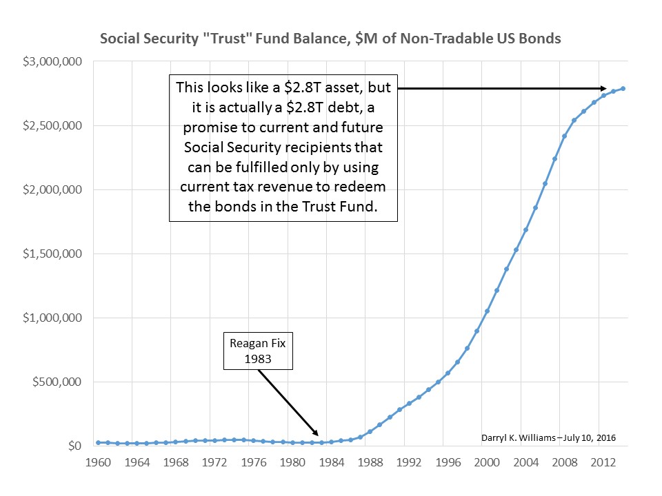
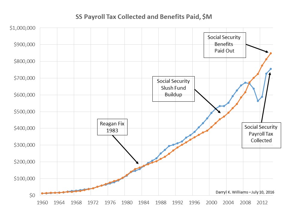
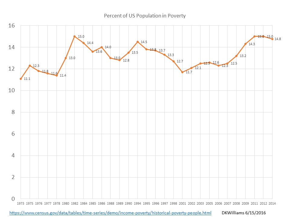
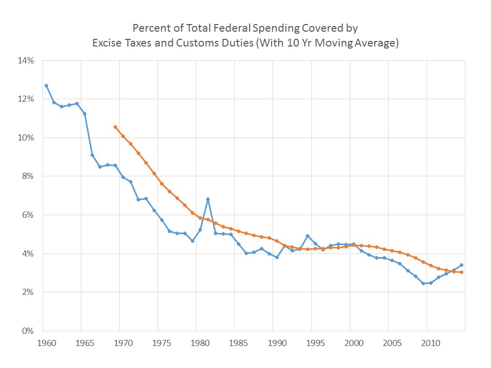
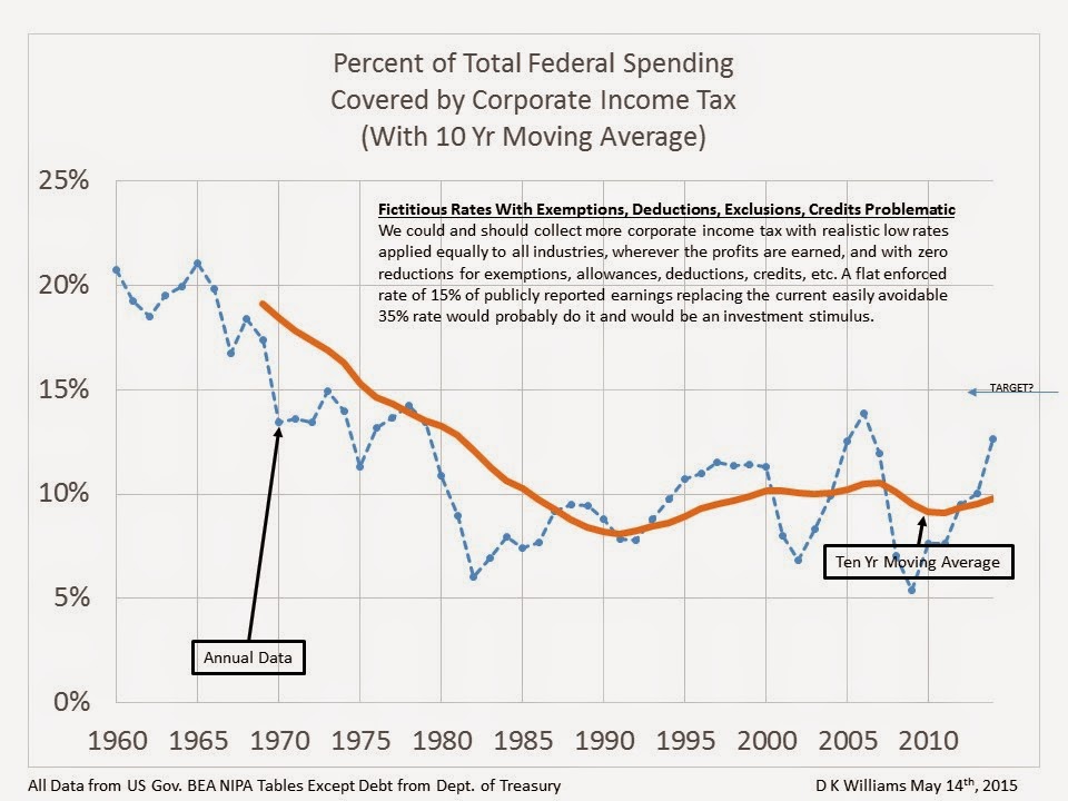
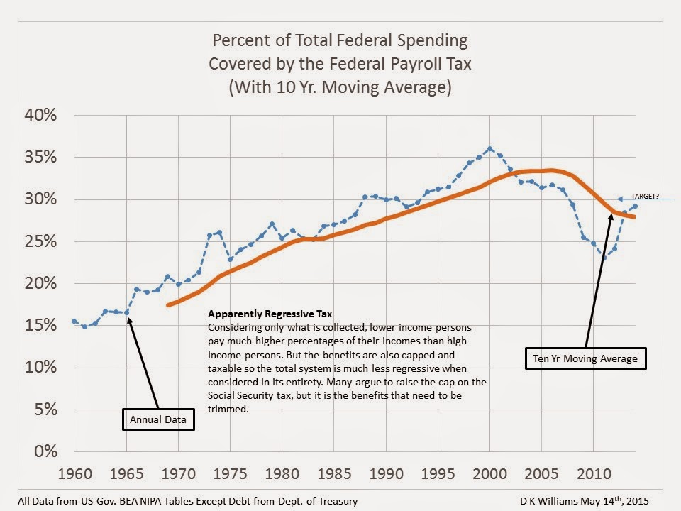
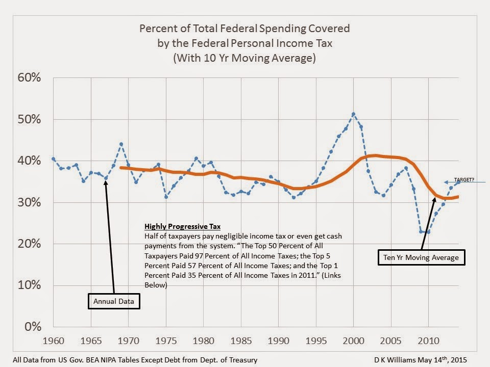
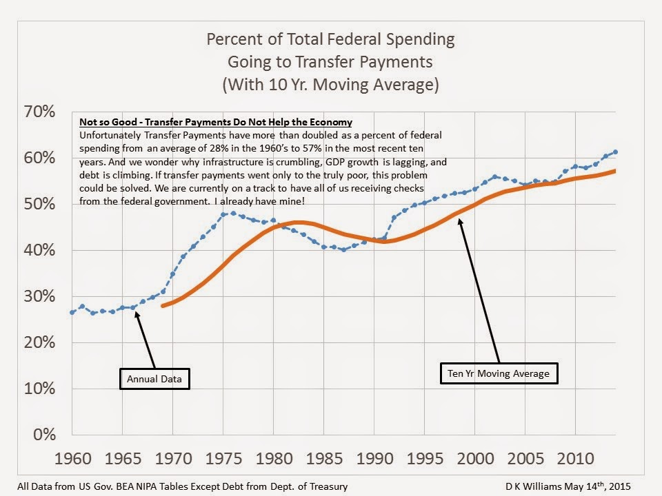
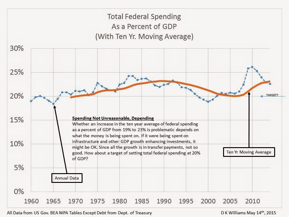
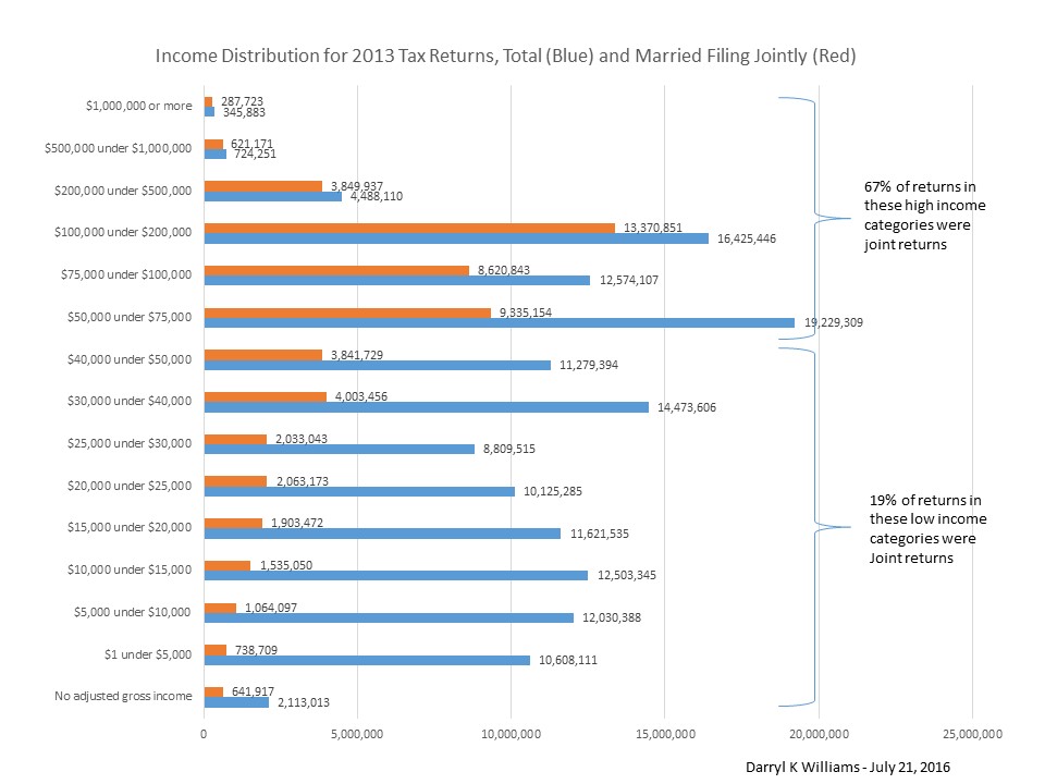
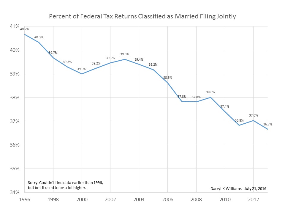
Key charts from Permanent Fixes are shown below. Click on any chart to go the the post for more explanation.
By way of introduction, let me say that the old saw, “Figures don’t lie but liars figure,” though of uncertain origin, is certainly true. One easy way that liars figure is to carefully pick and choose data, including beginning and ending points, to make a point. For example, it is literally true but completely meaningless to say that the Obama Administration has reduced the deficit by 61% since 2009 ($1.571T in second quarter of 2009 to $608B in first quarter of 2016). The significant truths ignored are that the deficit reduction has been a natural result of a combination of a very wimpy recovery and the record high deficits of 2009 when we were panicked over the real estate meltdown, and that real GDP growth and interest rates are both at historic lows as the deficit continues at historic highs.
To avoid accusations of picking and choosing data to make a point, I always try to take the data back several decades, all the way at least to 1960, the year of my high school graduation, if possible. And I always show long term trend charts, sometimes with moving averages to get rid of some of the noise in the data. I do that so whatever is going on at the present time has some reasonable context and allows some understanding of the normal variability.
A simple fact is that our economy and the global economy are large and sluggish and, no matter how strongly we want to blame or brag on a particular president’s economic performance, don’t change directions when one president leaves and another takes office. As a matter of fact, I would argue that the policies and actions of a president are much more likely to take effect in some future presidential term than in his or her own term.
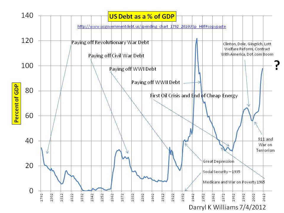
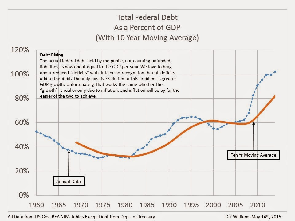
I use this first chart as an example since it illustrates a general long term upward trend in national debt as a percent of GDP beginning in the mid 1970’s and continuing through all subsequent administrations with the exception of President Clintons. The downturn during the 1990’s was primarily due to the dot com boom which increased tax revenues and reduced demands for welfare and other government spending. Well, he didn’t declare war on anyone, but he might have if the WTC attacks had happened a couple of years earlier.
